
Displays a set of summary cards in a grid, with options to show or hide asset details (such as lead paragraph, byline, image preview, etc.).
Block demo
To view a demonstration of some of the possible configurations of this block, please view the following link.
Block title
Block title emphasis
This property defined the "h" HTML tag for the block title, which may impact size, style and SEO value.
Block title background color
This property defines a background color for the block title. This overrides any default theme heading background color.
Block title text color
This property controls the block title text color. This overrides any default theme heading text color.
Block title note
Add additional notes below the title of this block.
Overline
Overline text
This property sets the text to use for the overline.
Overline text color
This property sets the text color for the overline.
Overline background color
This property sets the background color for the overline.
Overline icon
This property sets the icon to display next to the overline.
General
Links position
This property defines the location of the block links, which are defined under the "Links" tab.
Block content width
This property defines the width of the block content.
Block bottom margin
This property sets the bottom margin of the block.
Content discovery order
This property specifies whether the asset order from this block will be passed along and used to provide assets for content discovery features.
Followed notifications button
This setting enables users to save a followed notification so that they get an email whenever this block has new content.
Layout
Display Mode
This property determines how the block will appear to users.
Columns
The number of columns in which to arrange summary cards. Cards will adapt to fit the columns and collapse to a single column on small screens.
Background color box
This property will create a colored box around the asset card.
Card background color
This property will create a colored box around the asset card.
Text color
This property will change the asset card text colors. It is typically used to create contrast with the background color box.
Equal height
Flex the cards in each row to a matching height.
Compact Mode
Display compact cards on small screens. With the image in the top position, this option overrides other content options to provide a compact, minimal display on small screens.
Image
Show image
This property will show or hide the asset preview image.
Image size
This property controls the size of the asset preview image when the image is in the top position.
Aspect ratio
This property sets the aspect ratio of the asset preview image. If this property is set to inherit, the setting will inherit from the URL.
Position
This property determines the position of the image in the display.
Content
Show kicker
This property will either show or hide the asset kicker.
Show hammer
This property will either show or hide the asset hammer.
Headline size
This property sets the size of the asset headline.
Show lead
This property will either show or hide the asset lead paragraph.
Lead truncate
This property will truncate the lead paragraph to the number of characters defined.
Summary truncate
This property will allow the Lead truncate property to also truncate an asset summary. By default, asset summaries display in full regardless of the Lead truncate setting.
Read more link
This property will either show or hide a "Read more" link at the end of the lead paragraph. The lead paragraph must be set to true for this to show.
Read more text
This property will customize the "Read more" text.
Show section
This property will either show or hide the asset primary section tag above the headline.
Show flags
This property will either show or hide the asset flags above the headline.
Show byline
This property will either show or hide the asset byline.
Show author
This property will either show or hide the asset author.
Show date
This property will either show or hide the asset start date or updated time.
Show comment count
This property will either show or hide the asset comment count.
Show sharing buttons
This property will either show or hide the sharing buttons.
Share button type
This property provides choices for the share button display, plus the option to turn off the share buttons with the "none" selection. If the property is set to inherit, it will inherit this value from the URL property.
Show asset type icons
This property toggles the display of asset type icons. If this property is set to inherit, it will inherit this value from the URL property.
Show time-to-read estimate
This property determines where the time-to-read estimate will display.
Map
Show map
This property will either show or hide a map of assets with valid location data. Assets will appear as a pin on the map marking their location. When users click on the pin, it will load a dialogue box that displays a card of the asset.
Content discovery
Fetch assets
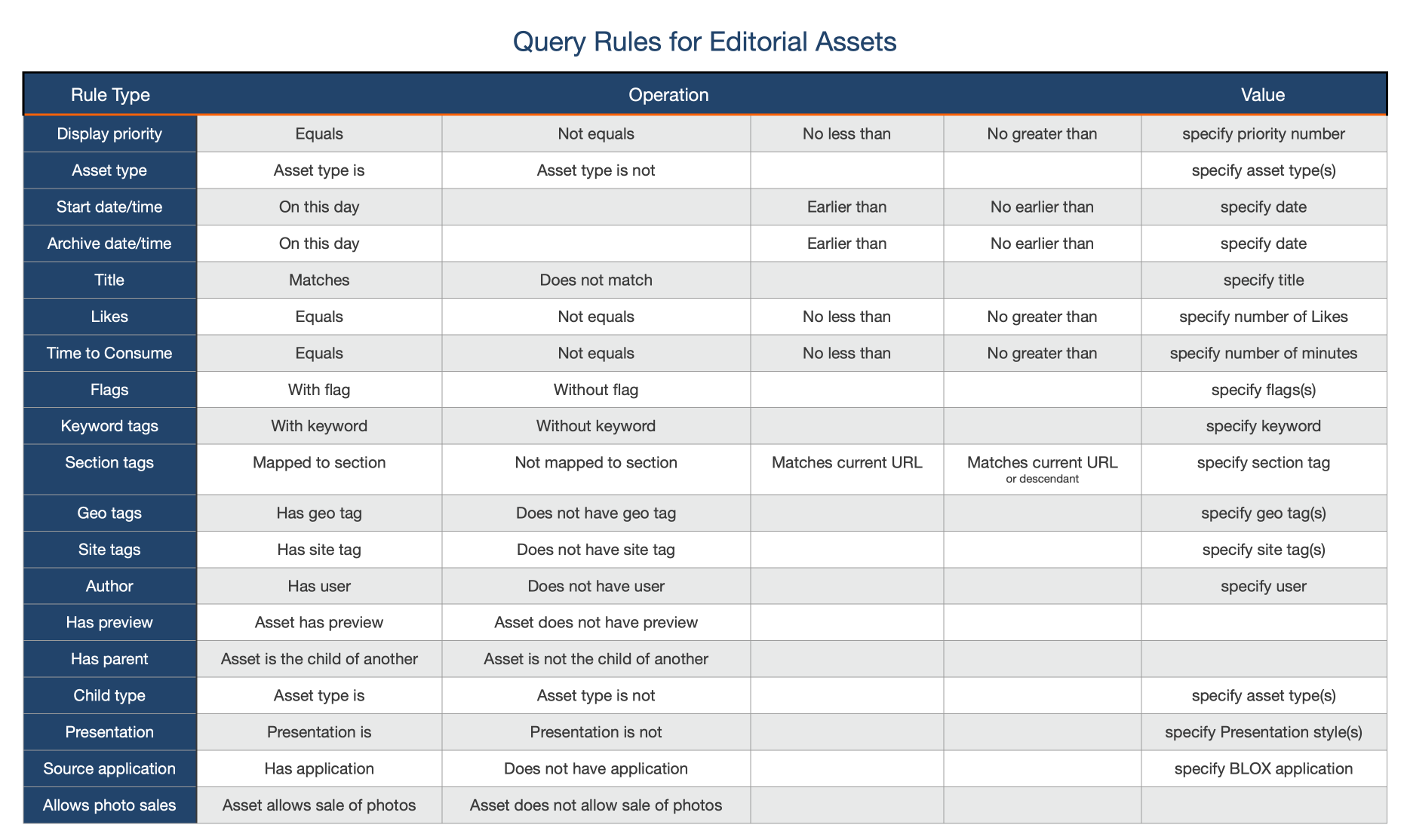
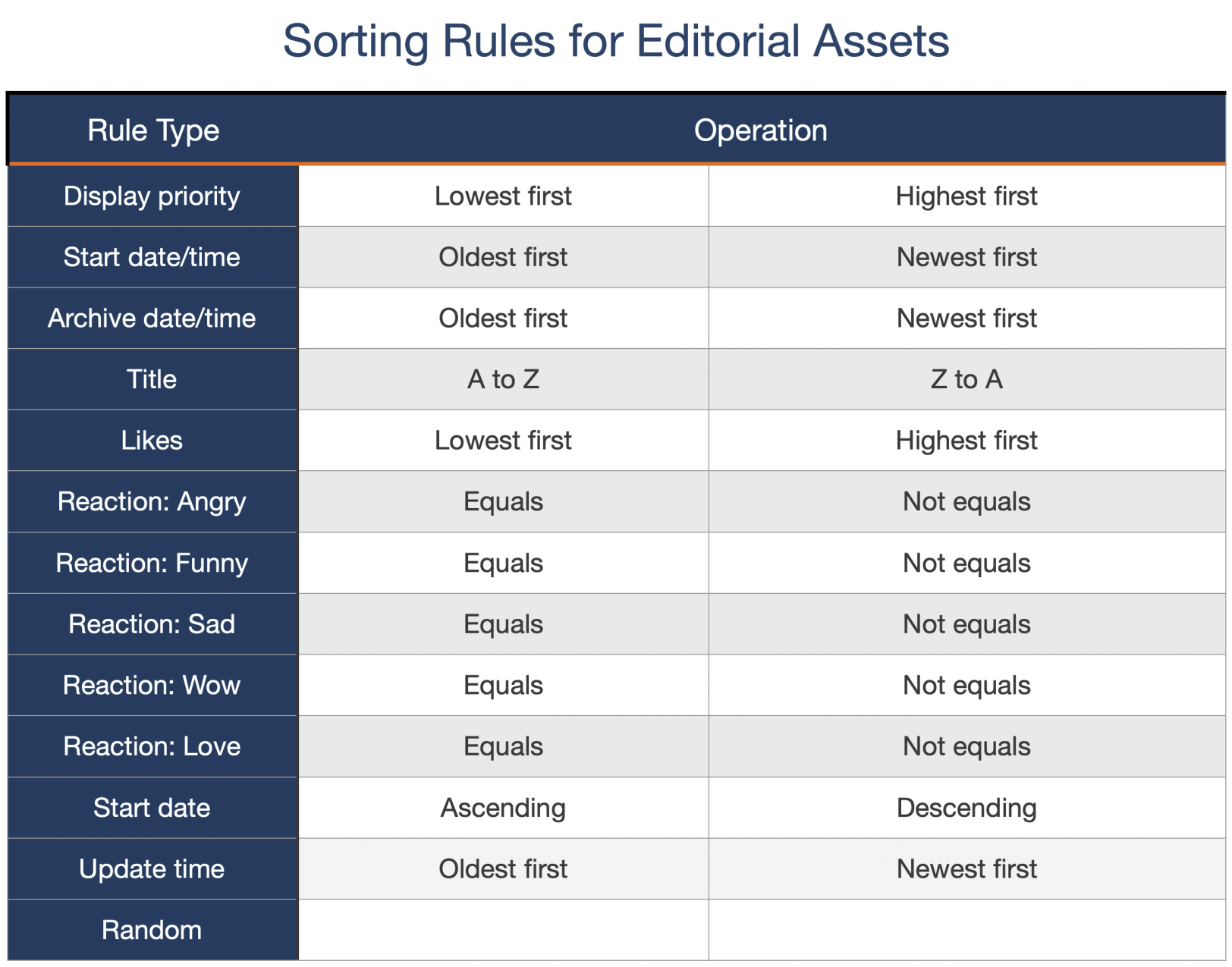
Determines the method used to fetch additional assets using the block query rules.
Search URL
Optional setting to change the base search URL for fetching assets.
Audience targeting
Show to audience (Comma separated list)
Show this block to users in the provided audience list. This feature requires participation in our iQ and Content Exchange programs.
Hide from audience (Comma separated list)
Hide this block to users in the provided audience list. This feature requires participation in our iQ and Content Exchange programs.
Google Ad Manager Advertising
Ad Unit
This setting allows you to declare the entire Ad Unit for the 300 x 250 ads displayed in Content Discovery.
Ad Interval
This setting defines the interval in which DFP ads are placed within Content Discovery.
Zones
Zone ID
This property defines the zone applied to the e-Edition asset URL.